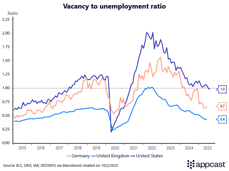
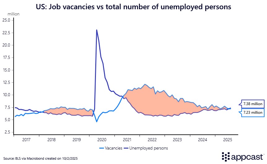
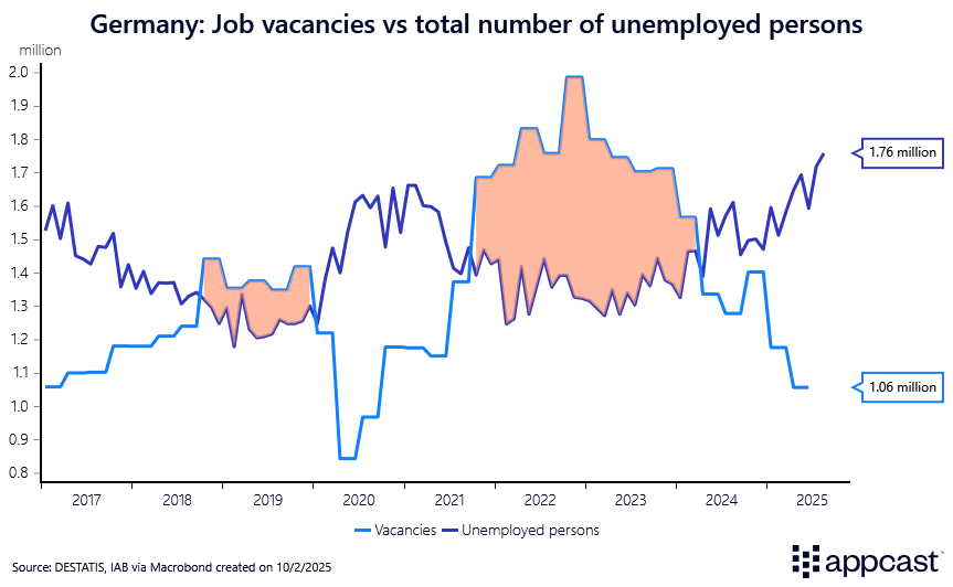
The chart below shows the ratio of total vacancies to the number of unemployed persons. This is a commonly-used measure of the extent to which the labor market is tight. If the ratio exceeds one, there are more vacancies than unemployed people in the economy, meaning the labor market is tight. Vice-versa, a lower ratio means that the labor market is looser because the number of unemployed people exceeds the number of vacancies.
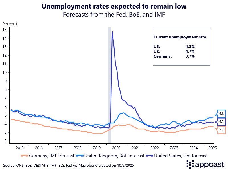
The chart below shows the national unemployment rate together with a long-run forecast for the unemployment rate, using the Federal Reserve projection for the U.S., the Bank of England projection for the U.K., and the IMF projection for Germany.
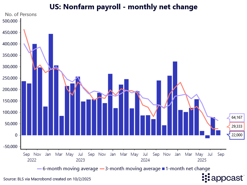
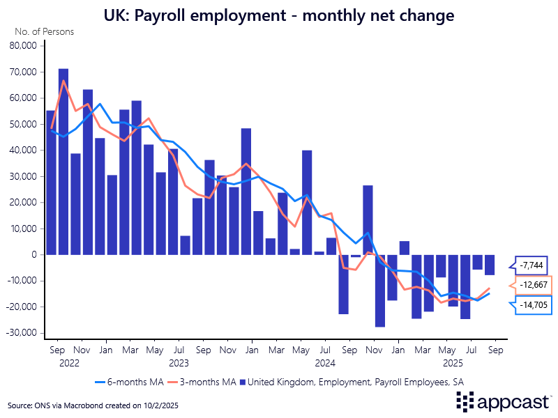
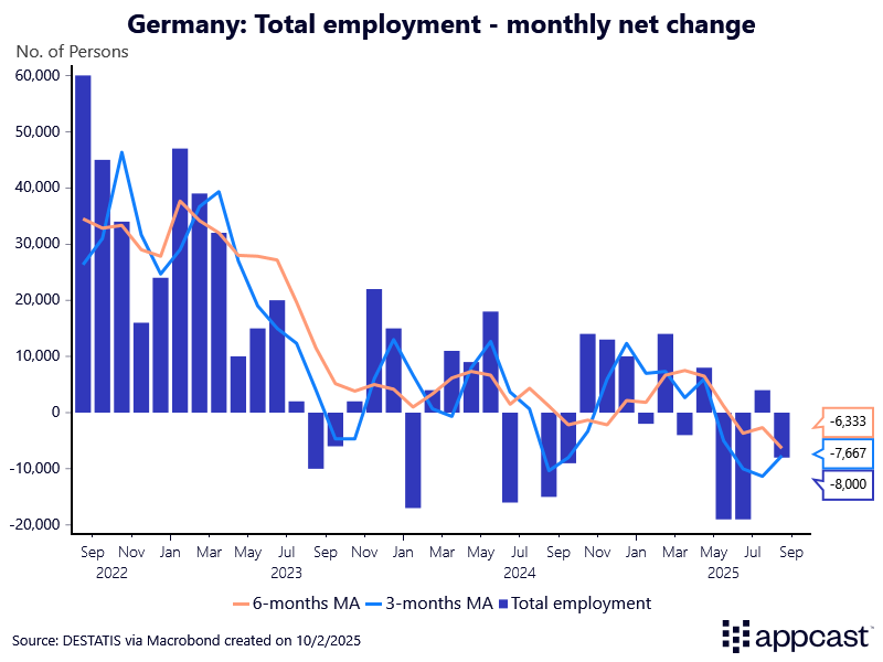
The following charts show monthly employment growth for each country. Because monthly jobs data can be very volatile, we have also added the three-month and six-month moving average to display the trend. For the U.S. and the U.K., we are showing the payroll employment numbers. Unfortunately, a similar data series is not available for Germany. We therefore use total employment numbers instead.
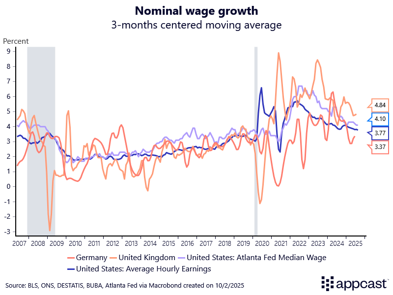
The chart below displays nominal wage growth for the three countries. The data is smoothed using a 3-months moving average. For the U.S., we include the average hourly earnings from the BLS as well as the median wage growth tracker from the Atlanta Fed. The latter has the advantage that it tracks the same individuals over time and therefore does not suffer from compositional effects (workers entering or exiting the labor market).
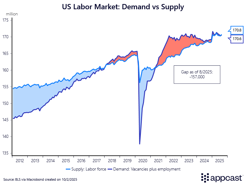
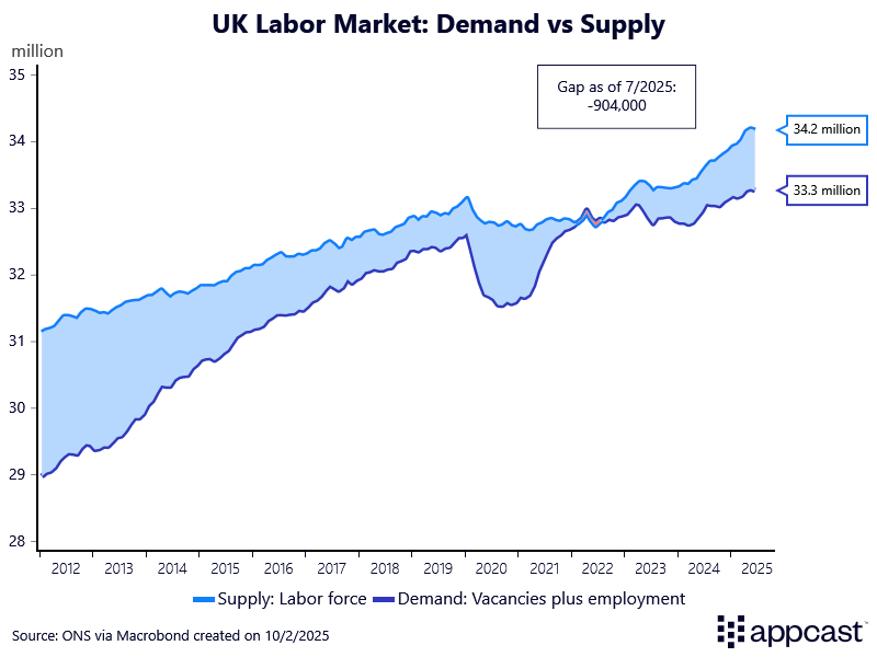
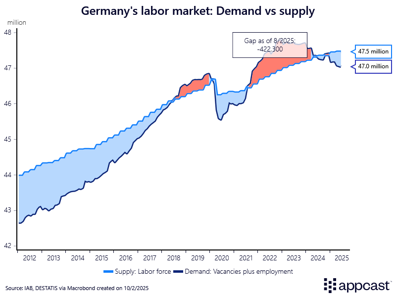
The following charts show the balance between labor market demand and labor market supply. Labor demand is proxied by total employment plus the total number of vacancies. Labor supply is proxied by the labor force, meaning the sum of employed and unemployed persons in the economy.